
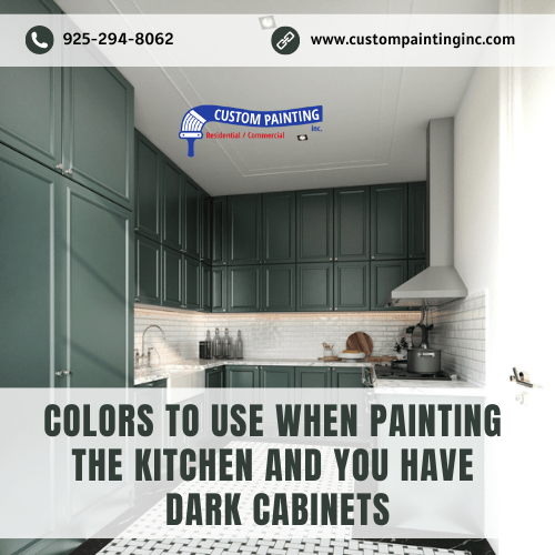
Choosing the right paint color for your Union City, CA area kitchen can be tricky, especially when you have dark cabinets. The color you choose can either complement the richness of the dark wood or create an overwhelming contrast. In this article, we’ll provide you with the best paint colors that work harmoniously with dark cabinets, helping you create a balanced and inviting kitchen space. Another consideration is to consider repainting your kitchen cabinets as well. Whether you’re aiming for a modern look or a cozy, classic feel, we’ve got you covered with expert tips and color suggestions.
Light and Neutral Colors
When pairing paint colors with dark kitchen cabinets, light and neutral tones are often the go-to choice. These colors not only create a beautiful contrast but also help to balance the overall look of the kitchen, making it feel more spacious and welcoming. Let’s explore why light and neutral colors are an excellent choice and some specific shades that work particularly well.
Benefits of Using Light Colors
- Creates Contrast: Light colors like whites, creams, and light grays provide a striking contrast to dark cabinets. This contrast highlights the richness of the dark wood, allowing it to stand out without overwhelming the space. The lighter walls draw the eye, making the cabinets the focal point while still keeping the room feeling airy.
- Enhances Brightness: Kitchens can often feel cramped, especially if they’re not well-lit. Light colors naturally reflect more light, brightening up the space. This is especially important in a kitchen with dark cabinets, as it prevents the room from feeling too dark or closed in.
- Adds Versatility: Light and neutral colors are incredibly versatile, easily blending with various design styles. Whether your kitchen has a modern, traditional, or transitional look, these colors adapt well, allowing you to change decor and accents without worrying about clashing with your wall color.
- Promotes Cleanliness: Light colors have a way of making spaces feel clean and fresh. In a kitchen, where cleanliness is paramount, this can be a significant advantage. It also makes any dirt or stains more visible, prompting quicker clean-up, which helps maintain a tidy appearance.
Examples of Specific Shades That Work Well with Dark Cabinets
- Crisp White (Benjamin Moore’s “Chantilly Lace”): A true white like “Chantilly Lace” offers a fresh, clean backdrop that pairs beautifully with dark cabinets. It creates a modern, bright look that makes the kitchen feel open and inviting.
- Soft Cream (Sherwin-Williams’ “Alabaster”): “Alabaster” is a warm, soft cream that brings warmth without overpowering the room. This shade is perfect if you want to create a cozy atmosphere while still maintaining a light, neutral palette.
- Light Gray (Behr’s “Silver Drop”): For those who prefer a more subtle contrast, “Silver Drop” is a light gray with a hint of warmth. It pairs well with dark cabinets, offering a sophisticated and understated look that works well in both modern and traditional kitchens.
- Warm Beige (Farrow & Ball’s “Slipper Satin”): “Slipper Satin” is a warm beige that adds depth to the walls without competing with the dark cabinets. It’s a great choice if you want a slightly richer tone that still maintains a light and airy feel.
Using these light and neutral shades in your kitchen will not only complement your dark cabinets but also create a harmonious and inviting space where you’ll love spending time.
Warm Tones
Warm tones, such as soft yellows and warm beiges, can bring a sense of coziness and balance to a kitchen with dark cabinets. These colors add a touch of warmth that can make a Fremont, CA area home feel more inviting and comfortable, creating a perfect harmony with the richness of dark wood. Here’s how warm tones can transform your kitchen and tips for choosing the right shades to complement your dark cabinetry.
How Warm Colors Add Coziness and Balance
- Enhances Warmth: Warm tones naturally evoke a sense of warmth and comfort. In a kitchen with dark cabinets, which can sometimes feel heavy or imposing, warm colors help soften the overall look, making the space feel more inviting. This is particularly effective in kitchens where you want to create a welcoming, homely atmosphere.
- Creates a Balanced Look: Warm colors can balance the depth and intensity of dark cabinets. While the dark cabinetry provides a strong, bold presence, warm tones on the walls counterbalance this by adding a lighter, more approachable element. This balance prevents the kitchen from feeling too dark or overly formal, making it a more pleasant space to cook and entertain.
- Adds Depth and Dimension: Soft yellows and warm beiges can add depth to your kitchen walls, creating a layered look that adds dimension. This is especially important in kitchens where you want to avoid a flat, one-dimensional appearance. The interplay between the warm tones and dark cabinets can give your kitchen a rich, textured feel.
Tips on Choosing the Right Warm Tones to Complement Dark Cabinetry
- Consider the Undertones of Your Cabinets: Before choosing a warm wall color, take a close look at the undertones in your dark cabinetry. If your cabinets have a reddish or mahogany undertone, opt for warm colors with similar undertones, like a soft yellow with a hint of gold or a beige with a peachy tint. This will create a cohesive look that ties the cabinets and walls together seamlessly.
- Balance with the Kitchen’s Natural Light: The amount of natural light your kitchen receives can influence how warm tones appear on the walls. In a kitchen with plenty of natural light, you can opt for richer, warm tones like a deep beige or a muted terracotta. In a kitchen with less natural light, stick to lighter, warm shades like pale yellow or a creamy beige to keep the space from feeling too dark.
- Test Samples Before Committing: Warm tones can vary greatly depending on lighting and surrounding elements. It’s a good idea to test paint samples on your walls before making a final decision. Observe how the colors look at different times of the day and how they interact with the dark cabinets. This will help ensure you choose a warm tone that complements the cabinetry and enhances the overall feel of the kitchen.
- Coordinate with Accents and Decor: When selecting a warm tone, consider how it will coordinate with other elements in the kitchen, such as countertops, backsplash, and flooring. A warm beige, for example, can tie together natural stone countertops and wood floors, creating a harmonious look. Similarly, a soft yellow can complement brass or gold accents, adding a touch of elegance to the space.
Cool Tones
Cool tones, such as light blues and greens, are an excellent choice if you’re aiming to create a fresh, modern look in your kitchen. These colors bring a sense of calm and cleanliness, contrasting beautifully with dark cabinets to add a touch of sophistication and serenity to your Newark, CA area home. Here’s how cool tones can elevate your kitchen and some specific shades that pair well with dark cabinetry.
Using Cool Colors to Create a Fresh, Modern Look
- Adds Freshness and Clarity: Cool tones like light blues and greens evoke feelings of freshness and tranquility, making them perfect for a kitchen environment. When paired with dark cabinets, these colors help to lighten the space, adding clarity and a crisp, modern aesthetic. This fresh look can make your kitchen feel more open and airier, even if the space is on the smaller side.
- Brings a Modern Edge: Cool tones are often associated with contemporary design. Light blues and greens can give your kitchen a sleek, modern edge without feeling too stark or clinical. They offer a clean backdrop that complements the boldness of dark cabinets, striking a balance between traditional richness and modern simplicity.
- Enhances Visual Contrast: The contrast between dark cabinets and cool-colored walls can be striking. Cool tones help to highlight the depth and richness of the dark cabinetry, creating a visually appealing and dynamic space. This contrast is especially effective in kitchens where you want to make a bold design statement.
Specific Cool Shades That Pair Well with Dark Cabinets
- Soft Blue (Sherwin-Williams’ “Sea Salt”): “Sea Salt” is a light, muted blue with a hint of green, offering a calming, serene backdrop that pairs beautifully with dark cabinets. This shade is perfect for creating a spa-like atmosphere in the kitchen, balancing the dark tones with a touch of softness.
- Pale Green (Benjamin Moore’s “Pale Oak”): “Pale Oak” is a subtle, pale green that brings a sense of freshness to the kitchen. This color works well with dark cabinets by adding a gentle contrast that feels both modern and timeless. It’s a great choice if you want to introduce a hint of color without overpowering the space.
- Light Gray-Blue (Behr’s “Hushed Hue”): “Hushed Hue” is a light gray-blue that offers a sophisticated, cool tone without being too bold. This shade pairs excellently with dark cabinets, creating a sleek and elegant look that’s perfect for a contemporary kitchen.
- Mint Green (Farrow & Ball’s “Cromarty”): “Cromarty” is a soft, muted mint green that adds a refreshing vibe to your kitchen. It’s a cool tone that complements dark cabinetry beautifully, offering a pop of color that’s still subtle and refined. This shade is ideal for kitchens where you want a light, breezy feel.
Bold and Dramatic Choices
For those who love to make a statement, bold colors like deep reds and rich blues can bring an exciting, dramatic flair to your San Jose area kitchen. These colors can add depth and personality, transforming the space into a true reflection of your style. However, using bold colors effectively requires careful planning to ensure they enhance rather than overwhelm the kitchen. Here’s how to incorporate bold colors and some tips on using them as accents to create visual interest.
When and How to Use Bold Colors Effectively
- Choose Bold Colors for Focal Points: Bold colors work best when used strategically as focal points in the kitchen. Consider painting a feature wall in a deep red or rich blue to create a stunning backdrop for your dark cabinets. This approach allows the bold color to shine without overpowering the entire space, adding depth and drama in just the right measure.
- Pair Bold Colors with Neutrals: To keep the kitchen from feeling too intense, pair bold colors with neutral tones. For example, if you choose a deep red for one wall, balance it with light, neutral colors on the surrounding walls and surfaces. This contrast allows the bold color to stand out while the neutrals keep the space grounded and harmonious.
- Use Bold Colors in Large, Well-Lit Kitchens: Bold colors tend to work best in larger kitchens with plenty of natural light. In a spacious, well-lit kitchen, deep reds and rich blues can add warmth and character without making the room feel cramped or dark. If your kitchen is smaller or lacks natural light, consider using bold colors in smaller doses, such as in accents or decor, rather than on large surfaces.
Tips on Using Bold Colors as Accents to Enhance Visual Interest
- Incorporate Bold Colors in Backsplashes: A bold-colored backsplash can serve as a striking accent in your kitchen. Whether it’s a rich blue tile or a deep red mosaic, the backsplash offers a perfect opportunity to introduce bold colors without overwhelming the space. It creates a visual focal point that draws the eye and adds a touch of luxury and sophistication.
- Add Bold Color Through Accessories: If you’re hesitant to commit to bold colors on the walls, consider incorporating them through accessories like bar stools, pendant lights, or small appliances. For example, deep red bar stools against dark cabinets can create a dramatic contrast that enhances the kitchen’s overall aesthetic. This approach allows you to experiment with bold colors in a more flexible and less permanent way.
- Use Bold Colors in Cabinetry or Island: For a truly daring look, consider using bold colors in your cabinetry or kitchen island. A rich blue island, for instance, can become the centerpiece of the kitchen, adding a splash of color that contrasts beautifully with dark cabinets. Pairing a bold-colored island with more neutral walls and countertops will keep the look balanced and cohesive.
- Introduce Bold Color Through Art and Decor: Art and decor offer another way to bring bold colors into your kitchen. A large piece of artwork in a deep red or rich blue can instantly add drama and personality to the space. Similarly, bold-colored vases, rugs, or even a statement clock can inject vibrant color, creating a dynamic and visually interesting kitchen.
Using bold and dramatic colors in your kitchen is all about balance. By thoughtfully incorporating these hues as focal points or accents, you can create a space that’s not only visually stunning but also harmonious and inviting. Whether you go for a deep red feature wall or rich blue accessories, bold colors can transform your kitchen into a truly unique and memorable space.
Practical Tips for Painting
Painting your kitchen is a great way to refresh the space and add a personal touch to your Santa Clara home, but it’s important to approach the project with careful preparation and planning. From getting the room ready to choose the right finishes, every step matters in achieving a professional-looking result. Here’s a step-by-step guide to preparing your kitchen for painting, along with advice on selecting paint finishes and coordinating with other kitchen elements.
Step-by-Step Guide to Preparing the Kitchen for Painting
1. Clear and Cover the Area:
- Start by removing as many furniture and kitchen items as possible. Take down curtains, blinds, and wall decorations. Move larger items like tables and chairs to the center of the room, covering them with plastic sheets to protect them from dust and paint splatters.
- Cover countertops, appliances, and the floor with drop cloths or plastic sheeting. Use painter’s tape to secure the coverings and protect the edges from paint.
2. Clean the Walls and Surfaces:
- Kitchens accumulate grease, grime, and food particles over time, so it’s crucial to clean the walls and surfaces thoroughly before painting. Use a mild detergent mixed with warm water or a degreasing cleaner to scrub the walls, paying special attention to areas near the stove and sink.
- After cleaning, rinse the walls with clean water and let them dry completely before moving on to the next step.
3. Repair and Sand the Surfaces:
- Inspect the walls for any cracks, holes, or imperfections. Use a spackle or a suitable filler to repair any damage. Allow the filler to dry, then sand the repaired areas until they are smooth and flush with the surrounding surface.
- Lightly sand the entire wall surface to create a smooth base for the paint to adhere to. Wipe away any dust with a damp cloth or tack cloth.
4. Prime the Walls (if needed):
- If you’re painting over a dark color or if the walls have never been painted before, applying a coat of primer is essential. Primer helps the paint adhere better and provides a more even finish.
- Choose a primer that’s appropriate for your wall type and the color you plan to use. Apply the primer with a roller, using a brush for edges and corners. Let it dry completely before applying the paint.
5. Apply the Paint:
- Start by cutting in around the edges of the walls, ceiling, and any fixtures with a brush. Use a roller to apply the paint to the larger areas, working in small sections and using even, overlapping strokes.
- Apply at least two coats of paint, allowing each coat to dry according to the manufacturer’s instructions. This ensures a smooth, durable finish with even color coverage.
6. Clean Up and Reassemble:
- Once the paint is dry, carefully remove any painter’s tape and coverings. Clean your brushes, rollers, and other tools. Replace any fixtures, and return the furniture and kitchen items to their original positions.
Advice on Choosing Paint Finishes and Coordinating with Other Kitchen Elements

1. Choosing the Right Paint Finish:
The finish you choose for your kitchen paint is crucial, as it affects both the appearance and durability of the walls. Here are some common finishes to consider:
- Matte or Flat: These finishes offer a smooth, non-reflective surface that’s great for hiding imperfections, but they may not be the best choice for kitchens due to their lack of durability against moisture and stains.
- Eggshell: Eggshell has a slight sheen and is more durable than a flat finish, making it a good choice for kitchens with low to moderate traffic.
- Satin: Satin finishes offer a soft, velvety sheen that’s easy to clean and resistant to moisture, making it ideal for kitchen walls.
- Semi-Gloss: Semi-gloss finishes are durable and easy to clean, with a noticeable shine. They’re excellent for areas that see a lot of wear and tear, such as trim, cabinets, and backsplashes.
- High-Gloss: High-gloss finishes are highly durable and reflective, but they can highlight imperfections. They’re best suited for cabinets, doors, and trim.
2. Coordinating with Other Kitchen Elements:
- Cabinets: When choosing a wall color, consider how it will interact with your kitchen cabinets. If you have dark cabinets, lighter or neutral wall colors can create a pleasing contrast. For lighter cabinets, consider bolder or warmer wall colors to add depth and character.
- Countertops and Backsplash: The color of your countertops and backsplash should complement your wall color rather than compete with it. If you have a busy or patterned countertop, opt for a more subdued wall color to let the countertop stand out.
- Flooring: Coordinate your wall color with your kitchen flooring. For example, if you have dark wood or tile floors, lighter walls can help balance the space. If your flooring is light, you have more flexibility to experiment with bolder wall colors.
- Lighting: The type of lighting in your kitchen can affect how the paint color appears. Consider the natural and artificial light sources and test paint samples in different lighting conditions before making a final decision.
By carefully preparing your kitchen and choosing the right finishes and colors, you can achieve a beautiful, cohesive look that enhances the overall design of your space. Whether you’re going for a subtle update or a dramatic transformation, these practical tips will help you get the job done with professional results.
Conclusion
Choosing the right paint colors for your kitchen can make a big difference in creating a space that feels welcoming, stylish, and uniquely yours. Whether you prefer light neutrals, warm tones, cool colors, or bold shades, there are plenty of options to complement your dark cabinets and enhance your kitchen’s overall look for your Milpitas area home.
For professional help with your kitchen painting project, contact Custom Painting, Inc. by calling 925-866-9610 or by filling out our contact form to schedule a consultation. We’re here to help you bring your vision to life.
