

Whether you’re doing a makeover or moving into a Newark, CA area new space, choosing a paint color for your apartment or condominium is essential for creating a welcoming and appealing atmosphere. Colors have a powerful influence on how spaces feel—whether it’s a calming neutral for relaxation or a bold accent to energize a room. The right choices can transform a residential property into a place tenants or homeowners love to call home.
Partnering with professional painting Fremont, CA area services takes this to the next level. Pros not only ensure a flawless finish but also offer expert advice on trending palettes that enhance both the aesthetics and overall value of multi-unit properties. It’s a smart investment that pays off in style and satisfaction!
Why color selections matter in multi-unit properties
First impressions for renters and buyers
Color plays a pivotal role in shaping initial impressions. Neutral, modern, or upscale tones can make units and shared spaces more inviting and appealing, drawing in potential renters or buyers. For example, soft neutrals can create a sense of spaciousness, while warm accents make spaces feel cozy and welcoming, increasing the likelihood of a positive emotional response. Its also important to keep with other aspects such as removing old awnings, repairing rotted wood, as well.
Branding and consistency
Cohesive color schemes across units and shared spaces establish a unified and professional appearance, contributing to a recognizable brand identity for the property. This consistency can set the property apart, fostering a sense of trust and reliability among tenants and visitors. For instance, a property using consistent earthy tones and greens might convey eco-friendliness, appealing to sustainability-minded renters.
Impact on tenant satisfaction
Well-chosen colors contribute to comfort and functionality, enhancing tenant satisfaction and retention. Calming tones in living spaces can reduce stress, while high-contrast or vibrant colors in common areas can add energy and engagement. Happy tenants are likelier to renew leases, recommend the property to others, and take pride in their living spaces.
Popular color trends for apartments and condominiums
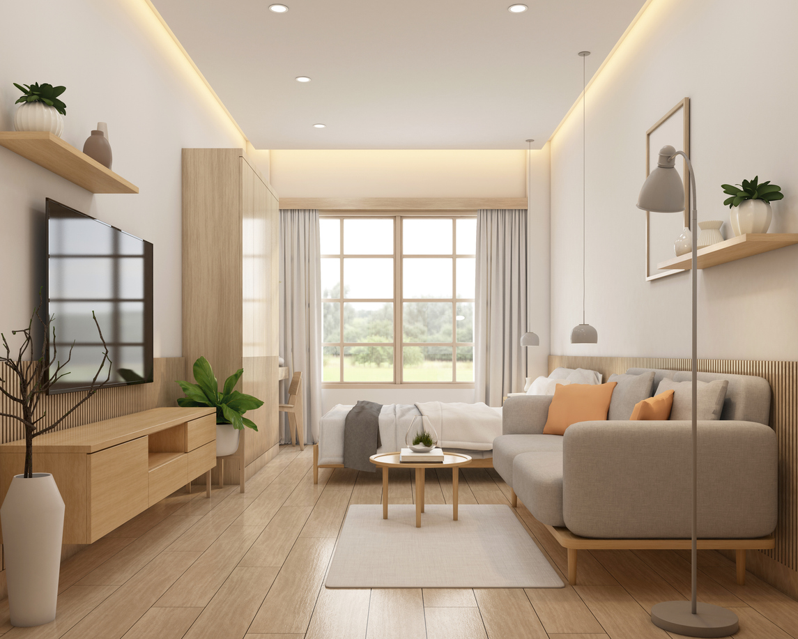
- Neutral tones – Whites, grays, and beiges remain timeless choices for apartments and condominiums. These colors create a clean, versatile backdrop that complements various design styles and appeals to a broad audience, making them ideal for rental properties and resale potential.
- Soft, warm hues – Soft creams, light taupes, and gentle pastels infuse warmth into a space without overwhelming it. These tones maintain a sense of neutrality while adding subtle coziness, making them perfect for living rooms and bedrooms.
- Earthy greens and blues – Nature-inspired colors like sage green and soft blue are increasingly popular for their calming effect and ability to evoke a connection to the outdoors. These hues are well-suited for areas like bathrooms and bedrooms, creating a serene ambiance.
- Bold accent colors for common areas – Many painters use bold colors such as navy or charcoal to add depth and create striking focal points in lobbies, hallways, or shared spaces. Accent walls, trim, or feature designs in these shades add personality and sophistication to communal areas.
Recommended color schemes for different areas
- Living rooms and bedrooms: Choose calming, neutral tones like soft beige, light gray, or muted pastels. These hues create a relaxing atmosphere, making them ideal for personal spaces while accommodating various styles and décor preferences.
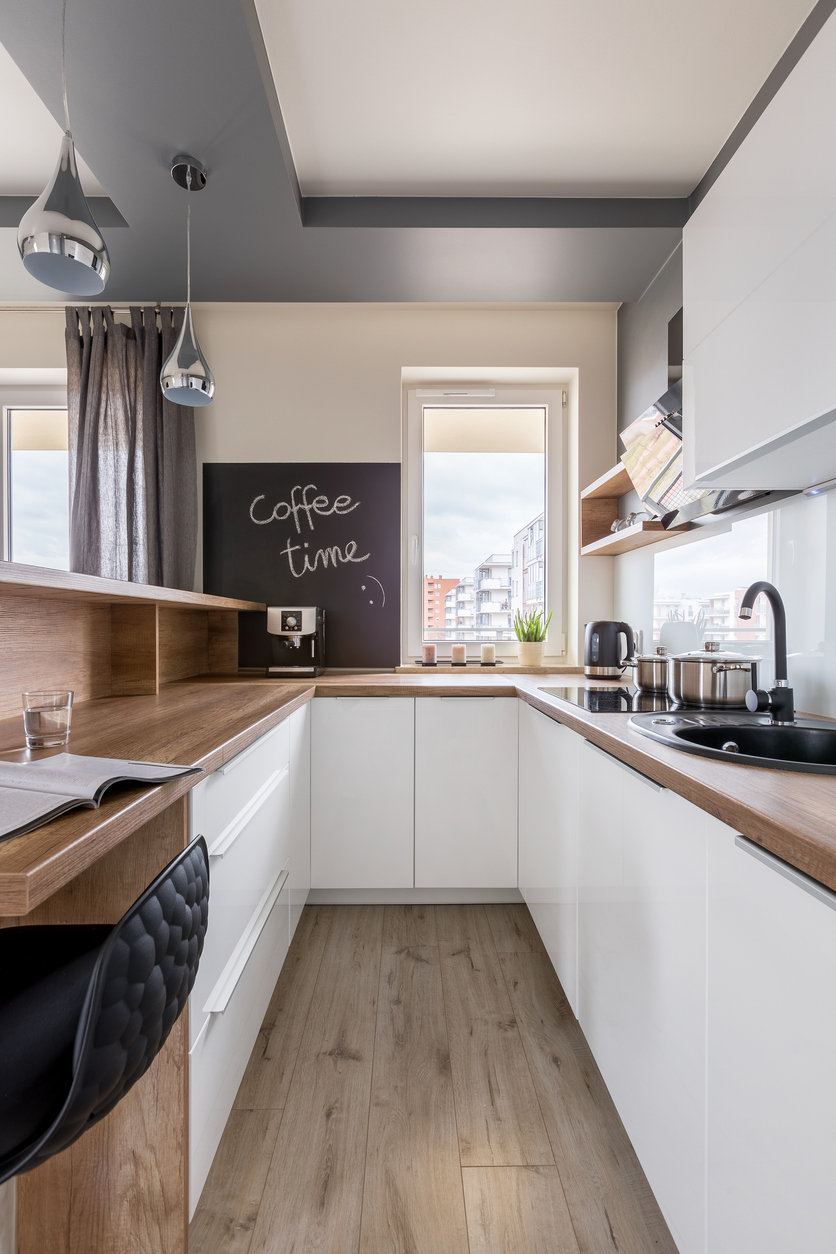
- Kitchens and dining areas: Choose soft grays, whites, or light pastels such as mint green or pale yellow. These colors enhance brightness, convey cleanliness, and promote a cheerful yet functional ambiance.
- Bathrooms: Choose fresh, light colors like crisp white, light blue, or soft green. These shades evoke a clean, spa-like feel, making the space appear fresh, serene, and inviting.
- Hallways and corridors: Use durable, light-reflective colors such as soft gray, cream, or off-white. These tones keep hallways feeling open, airy, and well-lit while enduring frequent use.
- Lobbies and common areas: Choose elegant, warm neutrals like taupe, beige, or ivory, complemented by rich accents like deep blue or burgundy. These combinations create a welcoming and sophisticated atmosphere for shared spaces.
Considering light and space when choosing colors
- Natural light: Colors can change dramatically depending on lighting. Natural light brings out true colors, while artificial light may cast warmer or cooler tones. In spaces with limited natural light, opt for bright or light colors like whites, creams, or pastels to make the room look more open and inviting. Dark colors in dimly lit spaces may feel heavy and constrictive.
- Space and depth: In smaller rooms, soft and light hues, such as pale blues, light grays, or muted yellows, create the illusion of more space by reflecting light. In larger rooms, darker shades like navy, charcoal, or deep green can add coziness and depth, making the area feel less cavernous.
- Transition and flow: To ensure a harmonious transition between rooms, choose complementary shades within a cohesive color palette. For example, use variations of a base color, such as a light gray in one room and a deeper slate gray in another. This approach ties spaces together while allowing for subtle variation.
Durable and easy-to-maintain paint options for multi-unit properties
- Choosing high-quality, durable paint – Opting for high-quality, durable paint ensures that walls can withstand frequent wear and tear, particularly in high-traffic areas such as hallways and shared spaces. Look for paints labeled as “scrub-resistant” or “washable” for added longevity and resilience.
- Low-maintenance finishes – Finishes like satin or eggshell provide the perfect balance between durability and aesthetics. These finishes resist scuffs and stains, are easy to clean, and maintain a polished look over time. They’re particularly suitable for rental units and common areas where cleanliness is key.
- Eco-friendly paint options – Low-VOC or zero-VOC paints are healthier alternatives for indoor use, reducing harmful emissions and odors. These eco-friendly paints not only create a safer environment for tenants but also align with sustainability trends, appealing to environmentally conscious renters.
Enhancing property appeal with professional painting services
- Expert color consultation – Professional painters often offer expert color consultation, helping property owners select colors that resonate with their branding and tenant preferences. This ensures the property exudes a welcoming and cohesive aesthetic while appealing to a broader audience.
- Efficient and high-quality application – Commercial painting companies are equipped to handle large-scale projects with minimal disruption. Their expertise and use of advanced tools ensure smooth application, durable finishes, and a polished look, boosting property appeal while respecting tenant schedules.
- Long-term cost savings – Professional painting services use high-quality materials and techniques, extending the life of the paint job. This reduces the need for frequent repaints and maintenance, ultimately lowering costs while maintaining a fresh and attractive property appearance.
Conclusion
Carefully chosen paint colors are crucial in transforming apartments and condominiums into inviting, attractive, and functional living spaces. The right palette enhances aesthetics, improves functionality, and creates a welcoming atmosphere that appeals to diverse residents.
Property managers and owners are encouraged to consult with a commercial painting company for expert guidance on color selection and professional services. Custom Painting, Inc.’s expertise ensures a durable, high-quality finish that maximizes the property’s appeal while minimizing maintenance needs. Contact us today at 925-866-9610 or message us here. Let us bring your vision to life with a flawless and long-lasting finish.
