

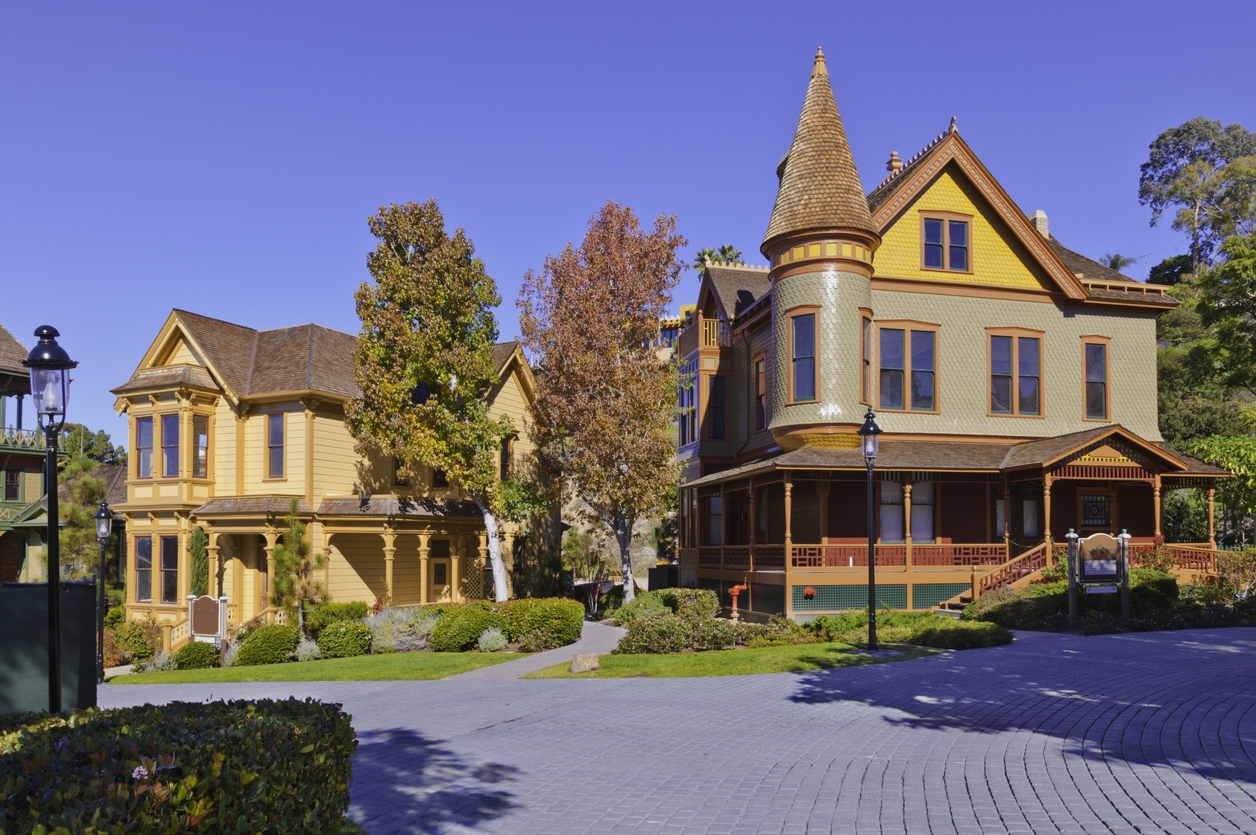
This article explores the growing trend of using two colors in exterior painting for Fremont area homes, a design choice that enhances both aesthetics and functionality. By combining two complementary or contrasting shades, homeowners can create a visually striking appearance that highlights architectural features and adds depth to the facade. Additionally, the strategic use of color can improve a home’s curb appeal and protect surfaces, offering beauty and durability.
Enhanced curb appeal
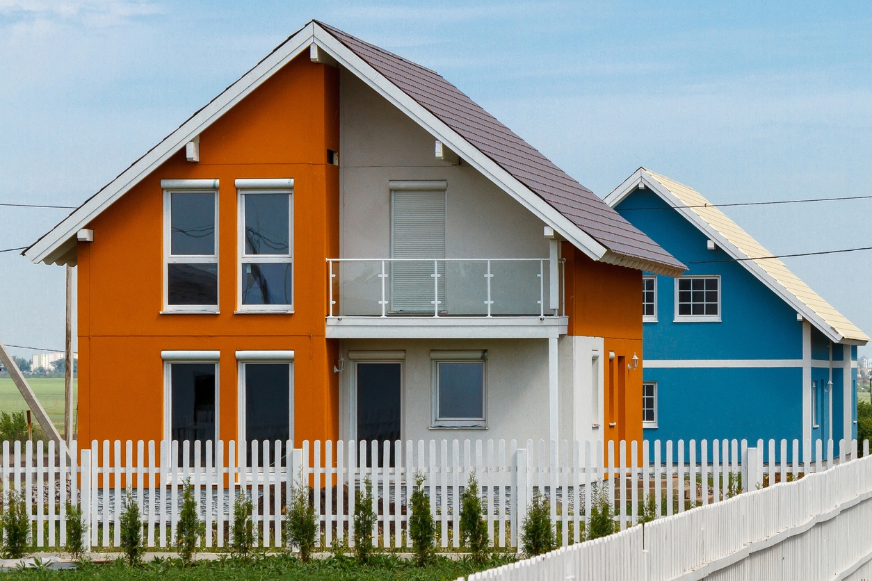
Using two colors for exterior painting enhances curb appeal by creating visual interest and making it stand out. This approach allows you to highlight your Union City home’s architectural features, such as trim, shutters, or doors, providing a balanced and aesthetically pleasing look. The contrast between the two colors can draw attention to specific elements of the home’s design, making it more distinctive and memorable.
Examples of popular color combinations include:
- Navy blue and white: A classic pairing that offers a crisp, clean appearance, with the white accentuating the trim and details against the rich, bold blue.
- Gray and yellow: A modern choice that combines a neutral gray base with vibrant yellow accents, adding a cheerful and welcoming touch.
- Taupe and cream: A subtle, elegant combination that creates a warm and inviting look, perfect for a more traditional or sophisticated style.
- Green and beige: A natural pairing that blends well with landscaping, giving the home a harmonious and earthy appeal.
These combinations enhance the home’s overall aesthetic, reflecting the homeowner’s style. It makes the property more appealing and potentially increases its value.
Highlighting architectural features
Contrasting colors can highlight architectural details like trim, windows, and doors. For example, using a light color for the main body of the home paired with a darker color for the trim can create a striking contrast that highlights the clean lines and intricate designs of the exterior. This technique works especially well for homes with classic or ornate details, allowing the trim to pop without overwhelming the overall aesthetic.
Techniques for highlighting unique architectural elements
Use a bold accent color on features such as shutters, front doors, or gables against a neutral base color to highlight your home’s unique architectural elements. Doing so draws the eye directly to these focal points, emphasizing the home’s character and craftsmanship. Using a slightly lighter or darker shade of the base color on elements like columns or archways can also subtly enhance their prominence without detracting from the overall cohesion of the exterior design.
Creating a balanced look
Creating a balanced look for home exteriors using two colors involves thoughtful selection and placement to achieve harmony. Here’s a brief guide:
Achieving harmony and balance with complementary colors
- Complementary Colors: These are colors opposite each other on the color wheel, such as blue and orange or yellow and purple. When used together, they create a dynamic yet balanced look by enhancing each other’s vibrancy.
- Application: Use one color as the dominant shade (covering larger areas like when painting aluminum or vinyl siding) and the other as an accent (for trim, shutters, and doors). Doing so creates a cohesive and visually appealing exterior without overwhelming the eye.
Tips for selecting colors that work well together
- Consider the architecture: Match your color choices to the style of the home. Traditional homes often look great with classic color combinations, while modern homes can handle bolder pairings.
- Test in natural light: Colors can look different in varying light conditions. Test samples on your exterior to see how they appear throughout the day.
- Balance warm and cool tones: If using a warm color like red or yellow, balance it with a cooler color like blue or gray to prevent the exterior from feeling too intense.
- Context matters: Consider the surrounding environment, such as landscaping and neighboring homes, to ensure your color choices harmonize with the setting.
Follow these guidelines to create a visually appealing and balanced exterior that enhances your home’s curb appeal.
Practical benefits
Using two colors for a home’s exterior offers practical benefits, including:
- Differentiation of sections: Applying different colors to your home’s various sections can help distinguish architectural features, such as separating the main structure from the garage or highlighting entryways and trim. This enhances visual interest and can make a large home more cohesive by breaking it into distinct zones.
- Lower maintenance with darker colors: Using darker colors on high-traffic areas, such as the lower portions of the home or near the garage, can minimize the appearance of dirt, scuffs, and wear. Darker shades are less likely to show grime, making them ideal for areas more exposed to daily use and environmental factors. This reduces the need for frequent cleaning and maintenance.
These practical strategies not only improve the home’s aesthetic appeal but also contribute to its longevity and ease of upkeep.
Flexibility in design
More design flexibility:
Two-tone color schemes offer increased design flexibility by allowing you to highlight different architectural features, such as trim, doors, and window frames, with contrasting or complementary colors. This approach adds depth and interest to the exterior, making it easier to achieve a balanced and visually appealing look. The flexibility also lies in the ability to combine subtle or bold colors to match the desired aesthetic, whether you prefer a classic or modern style for your Union City home.
Adapting to personal style and trends
Choosing two colors for your home’s exterior allows you to tailor the look to your style while allowing room to adapt to changing trends. For instance, a neutral base color combined with a bolder accent can easily be updated by changing the accent color over time. This adaptability ensures that your home remains stylish and reflective of your evolving tastes without the need for a complete overhaul.
Common mistakes and how to avoid them
When choosing and applying two colors for exterior spaces in Milpitas, common errors can detract from the overall appearance of your home. Here’s a breakdown of frequent mistakes and tips to ensure a cohesive, professional finish:
Frequent errors
- Lack of contrast: Using two colors that are too similar in tone can make the exterior look flat and uninteresting rather than accentuating architectural features.
- Clashing undertones: If the two colors have different undertones (e.g., one is warm and the other is cool), they can clash, creating a disjointed appearance.
- Ignoring the surroundings: Failing to consider the landscape, neighboring homes, and fixed elements like the roof or stonework can result in a mismatched look.
- Improper proportions: Applying the secondary color in the wrong proportion, such as using too much or too little, can throw off the balance and make the exterior look awkward.
Tips for a cohesive and professional finish
- Ensure sufficient contrast: Choose colors with distinct contrast to highlight architectural details, such as using a lighter shade for the main body and a darker hue for trims or accents.
- Match undertones: Select colors with complementary undertones. For example, if one color has a warm undertone, ensure the second color is warm to maintain harmony.
- Consider the context: Consider the surrounding environment, existing materials, and neighboring homes. This will help you choose colors that complement the area’s aesthetics.
- Test proportions: Before committing, use samples to test how the colors work together on a small exterior area. This will help you determine the right balance and proportion for each color.
Follow these tips to avoid these common errors and achieve a visually appealing and harmonious exterior that enhances your home’s curb appeal.
Conclusion
Experimenting with two-tone color schemes offers a unique opportunity to create a personalized and striking exterior for your home. Whether you’re looking to make a bold statement or achieve a subtle, sophisticated look, the possibilities are endless.
Call us at Custom Painting, Inc. at 925-866-9610 or message us on our contact page to help you bring your vision to life. Let our skilled, licensed, and insured team of paint experts help you transform your home with a beautifully crafted two-tone exterior.
